The Color Theory of Dressing: What to Wear to Enhance Your Features
Color theory in fashion borrows principles from art and design, focusing on how colors interact and affect perception. The color wheel, which categorizes hues as primary, secondary, and tertiary, is a crucial starting point. Complementary colors—those opposite each other on the wheel—create striking contrasts, while analogous colors, sitting side by side, produce harmonious, understated effects.
Colors carry psychological impact in how they are perceived. Shades like red, orange, and yellow often radiate vitality and excitement, creating a sense of warmth and dynamism. On the other hand, blues, greens, and purples tend to feel more serene and composed, lending an air of elegance and tranquility to an outfit. Neutral shades like beige, gray, white, and black serve as versatile backdrops that allow accent colors to shine. When applied thoughtfully, these principles can enhance your natural features rather than compete with them.
Determine Your Skin Undertone
A key starting point for applying color theory in your wardrobe is understanding your natural skin undertone. Typically, undertones can be categorized as warm, cool, or neutral, and knowing which group you belong to helps in selecting colors that naturally enhance your complexion.
Warm undertones often have a golden, peachy, or yellowish hue. Colors like coral, amber, olive, and earthy tones harmonize with these undertones, bringing a natural glow to the skin.
Cool undertones usually show pink, red, or bluish tints. Jewel tones such as sapphire, emerald, and amethyst, as well as icy shades like lavender and pale blue, enhance these undertones.
Neutral undertones have a balanced mix of warm and cool tones, allowing for flexibility in color choice. Almost any hue works well, but muted and soft shades often create the most flattering effect.
A simple test involves looking at your veins in natural light: greenish veins indicate warm undertones, bluish or purple veins suggest cool undertones, and a mix points to neutral undertones.
Eye Color and Color Coordination
Since your eyes naturally draw attention, choosing clothing colors that harmonize with them can make your gaze appear more vivid and captivating. People with blue eyes can enhance their features with shades of orange, rust, or copper, which create a warm contrast. Green eyes pop with purples, deep plums, or soft peach tones. Brown eyes, being highly versatile, pair well with warm browns, golds, and even bright jewel tones like teal or burgundy.
Subtle touches like scarves, necklaces, or tops that echo your eye color can draw attention to your eyes without overwhelming the overall outfit. Similarly, layering different shades of complementary colors adds depth and visual interest.
Hair Color as a Guide
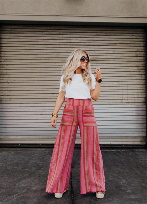
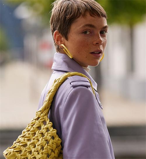
Hair color further informs your ideal palette. For those with blonde hair, soft pastels, warm neutrals, and cool icy tones often work beautifully, depending on skin undertone. Brunettes tend to shine in rich, saturated colors—think emerald green, navy, and burgundy. Redheads are naturally complemented by earthy tones, muted greens, and warm beiges, which harmonize with their vibrant hair.
Paying attention to hair and undertone together ensures that the chosen clothing doesn’t clash but instead accentuates natural beauty. For example, a warm-toned redhead wearing a bright turquoise top may find the color too jarring, whereas a soft olive or burnt orange will create a more cohesive, flattering effect.
Balancing Bold and Neutral Colors
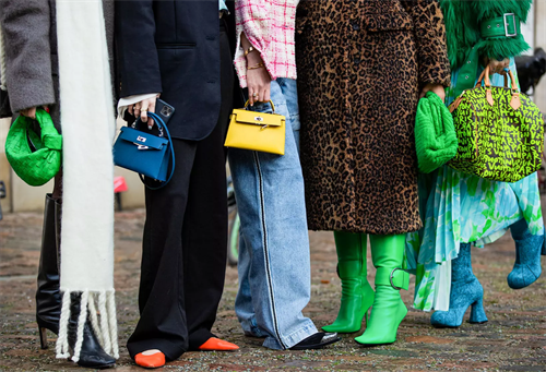
When integrating color theory into your wardrobe, balance is key. Bold colors should often be paired with neutral bases to prevent overwhelming the outfit. For instance, a statement red blazer looks striking over a simple beige dress, while a vibrant emerald skirt can be tempered with a white blouse. Accessories also offer a subtle way to introduce color without committing fully, such as using scarves, handbags, or shoes in accent shades.
Mixing textures alongside colors further enhances the outfit. Satin, silk, and glossy finishes reflect light, emphasizing the color’s impact, while matte fabrics create depth and subtlety. This combination allows you to use color strategically, highlighting facial features or body contours you wish to accentuate.
Seasonal Color Palettes
A popular approach among stylists is seasonal color analysis, which divides palettes into spring, summer, autumn, and winter. This technique takes into account your skin tone, eye color, and hair shade to determine a range of colors that naturally enhance your features and create a harmonious overall look. For example:
- Spring palettes favor light, warm, and clear tones such as peach, coral, and mint.
- Summer palettes work well with soft, cool colors like pastel blues, lavender, and dusty pink.
- Autumn palettes highlight warm, muted, and earthy tones, including camel, rust, and olive green.
- Winter palettes embrace bold, cool, and high-contrast colors like black, navy, and jewel tones.
Adopting a seasonal palette can simplify wardrobe planning and ensure that your clothing consistently enhances your natural features.
Practical Application
Incorporating color theory into your wardrobe can be done gradually, without needing to replace everything you already own. Start by assessing your current collection and identifying which colors best complement your complexion. Introduce new pieces strategically—perhaps a blazer, dress, or accessory in a color that highlights your undertones or eyes. Experiment with layering, texture, and contrast to create outfits that are both flattering and visually interesting.
Color is more than just a fashion statement—it’s a tool for personal expression and confidence. By understanding the color theory of dressing, you can make deliberate choices that enhance your features, convey your style, and transform your wardrobe from ordinary to intentional.